
Hey, everybody! It’s me, Dasch Fortner, the artist working on Egghead. I’ve decided to write a behind-the-scenes of sorts, showing the process of making the first page for the first issue (wow, lots of firsts). Before I dive into what I’ve done, however, I would like to take the time to laud Jordan on creating such an excellent script. So far the collaboration with him has kept me motivated, and his quality word-forming has been a great inspiration to continue. I personally really enjoy the story he has created, and am very glad to be a part of it.
Alright, now on to the drawing:
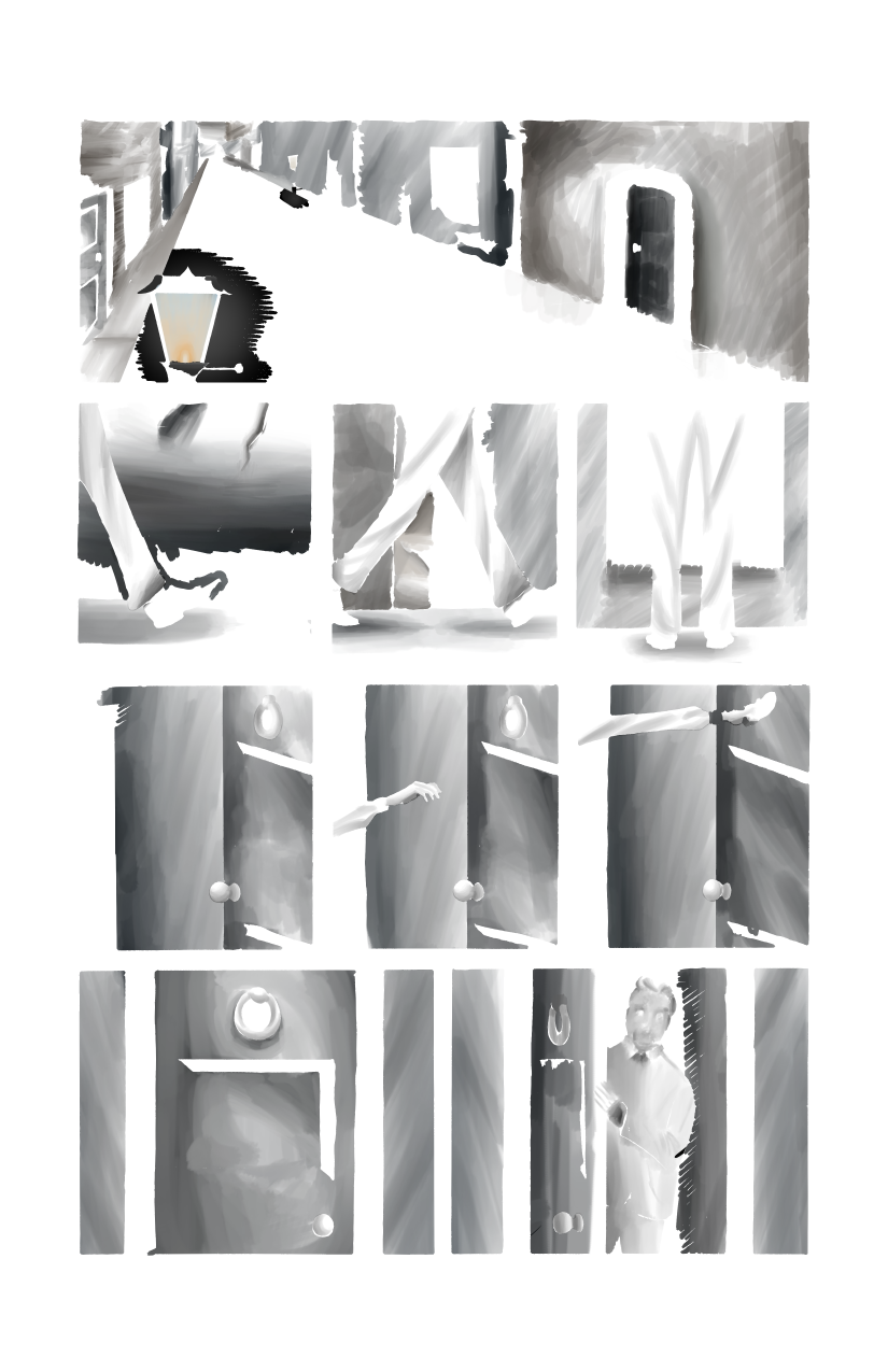
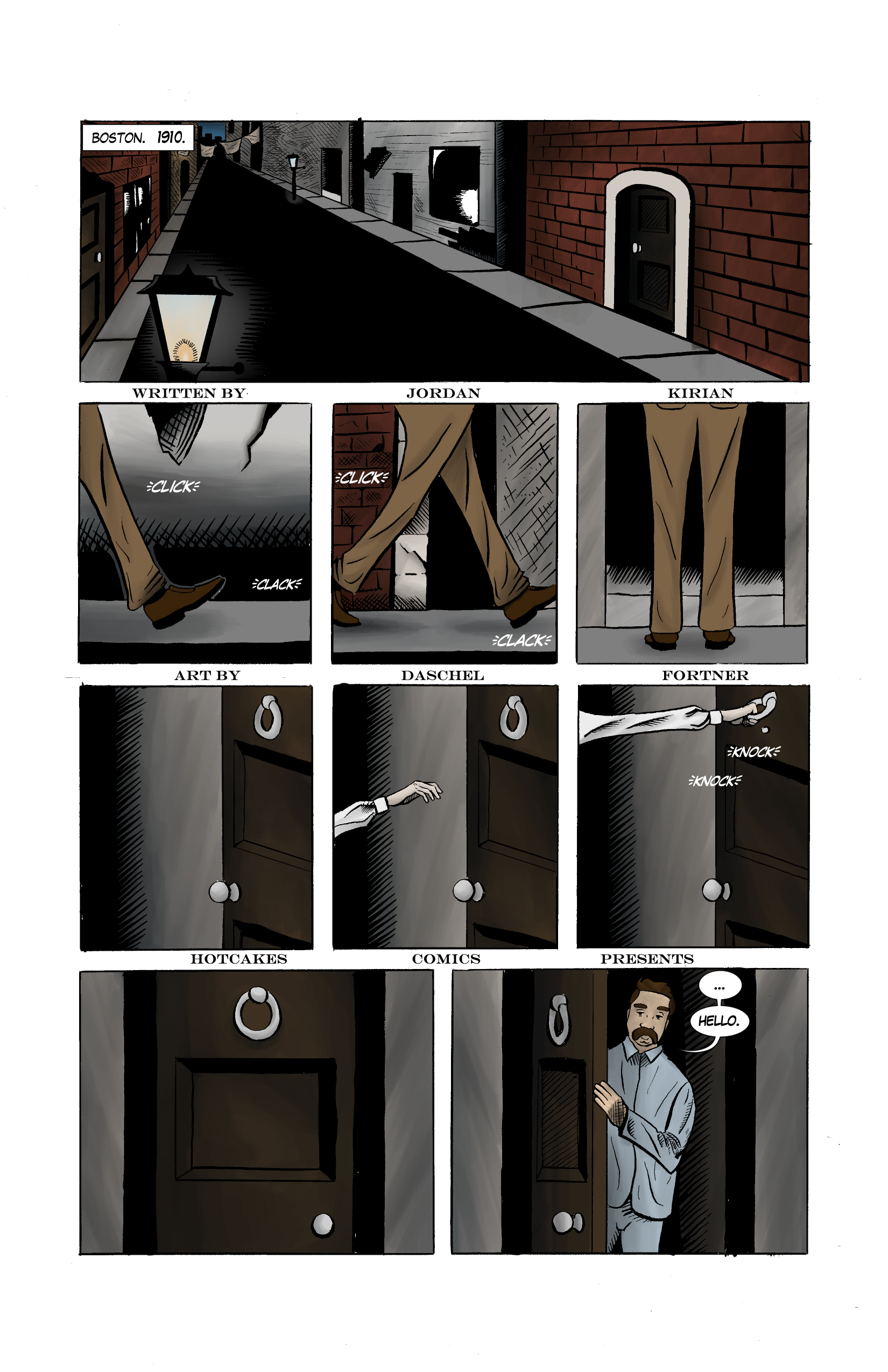
Step 1: Rough
I, like most people who draw comics, began by roughing out what my page was going to look like. I decided to do this step digitally, so I could easily share my ideas with Jordan. However, since I draw with pencil and paper, this was probably a really stupid thing to do. However, I think there are some benefits to roughing things out on the computer, such as using vectors to easily re-position panels, or the use of perspective rulers, and the ability easily undo mistakes or move something you don’t like. So, in the future I might migrate to digital completely, when I get as comfortable with the graphics tablet as I am with a pencil.
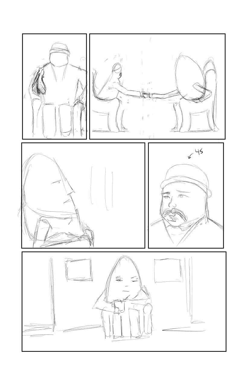
The rough for the first couple of pages were much more detailed than the last page I have roughed out. I had this idea that mapping out all the details would make the final drawing take less time, but it ended up just making the roughs take more of my time, and the penciling the same amount of time (probably because I switched mediums for the final pencils… *sigh*). I lost this strategy quickly, however, and ended up with roughs that probably only I can understand.
Step 2: Pencils
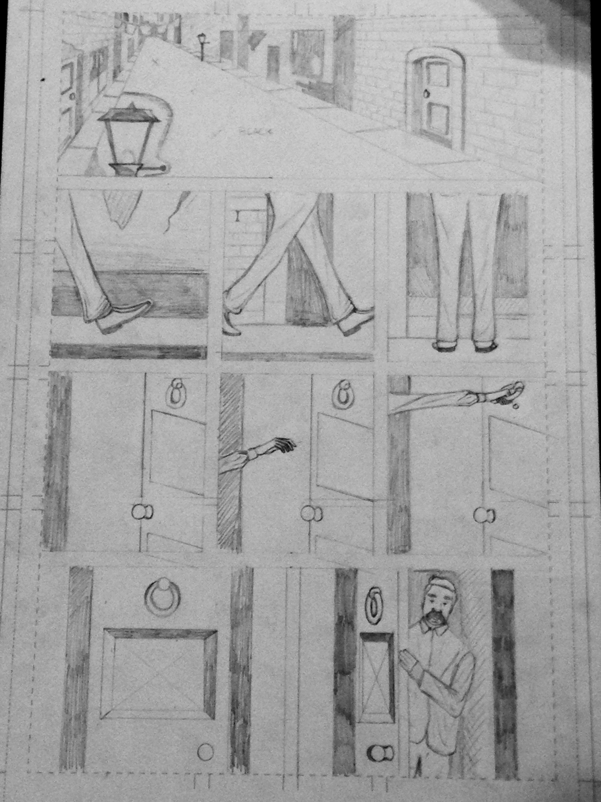
Yahoo! Next it was time to draw, so I whipped out my Bristol board and my #3 pencil and got to drawing. I don’t remember this page being particularly difficult to draw, but I do remember using a ruler quite a bit, because of all those buildings, doors, and perspective lines. I would say my favorite part about this page is the immigrant man in the bottom right panel. I find that drawing unnamed extras is one of the most fun things about comics, because you get to create these short-lived, unsung heroes of the book.
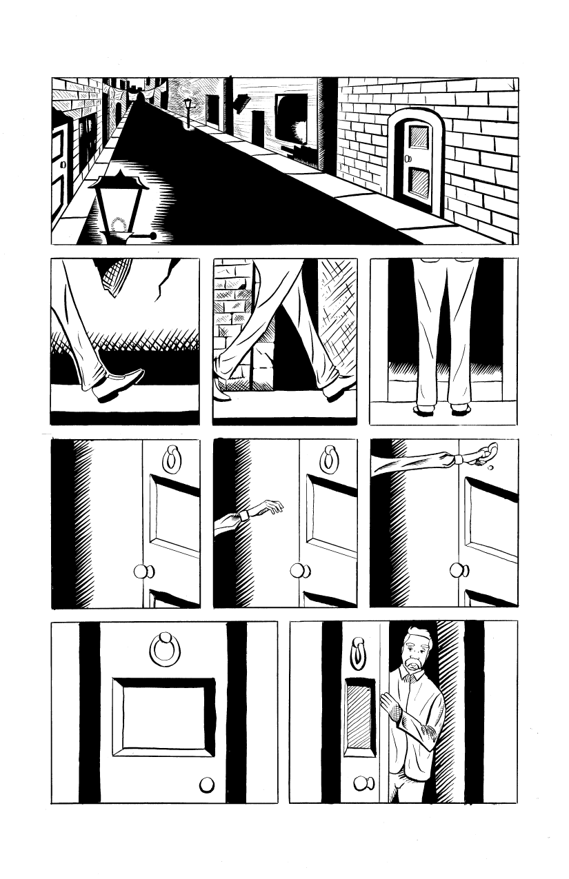
Step 3: Inks
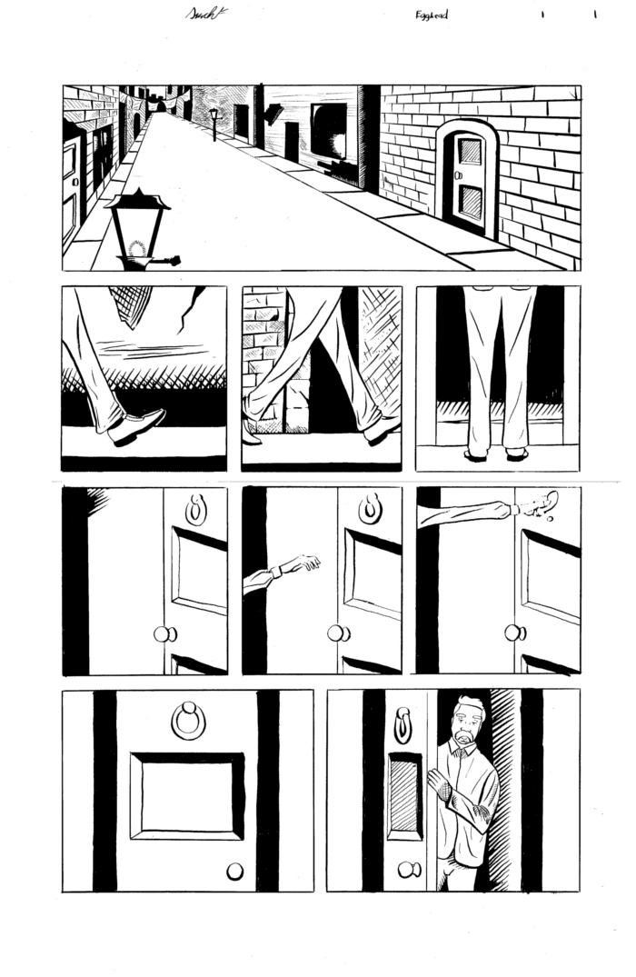
Boy, do I love to ink. This step is when I really think the image seems to take shape, and look complete. This page was inked with Speedball Super Black India Ink, and a fountain pen. I used the Zebra Comics G Nib mostly, but I also used a Hunt 512 Extra Fine nib. To fill in the black areas I used a Windsor & Newton Series 3 Watercolor brush. I find that I can get more control with a fountain pen than with a brush. I have inked with a brush before, but I find it difficult to get the very thin lines that a fountain pen produces.
I made an embarrassing amount of mistakes on this first page. In my defense, the ink on that lamppost took an unusually long amount of time to dry. After I inked it, I scanned the page into the computer by scanning the top half, then the bottom half, and matching them up in Gimp. Next up is correcting all those errors (I’m looking at you, crooked bricks).
Now I’m beginning to be more happy with the page overall. I added some feathering in some areas and fixed all the areas with which I was disappointed. I also added in the black areas that I was unsure about, such as the road. My approach to art is to use the strengths of every option. I am currently better at inking with a fountain pen and drawing with a pencil than I am with Manga Studio, so I do it traditionally. However, it’s much easier to correct a mistake on a computer than it is on paper, so I correct all my mistakes and do hard-to-undo inking digitally. This allows for more experimentation, since I’m not worried about ruining it by trying something new.
Step 4: Colors
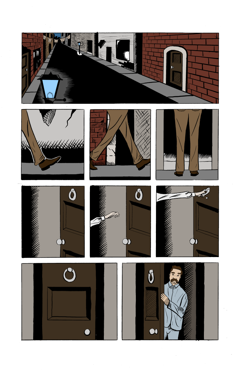
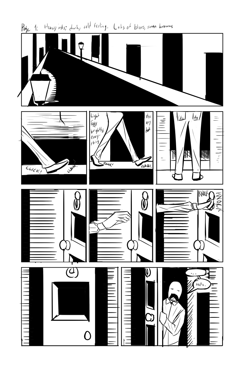
Next, I laid down my base colors. I really wanted to go with a monochromatic color scheme, but the bricks kind of ruined that for me. Instead, I went with mostly complementary, choosing browns for the legs and lots of the buildings, and blues in some areas, such as the lamp. There’s something I really like about just the flat colors with the inks. It’s very pure and has a classic feeling. However, color is such an important part of the page that it needs to stand out, and I think shading is able to do that.
Step 5: Shading
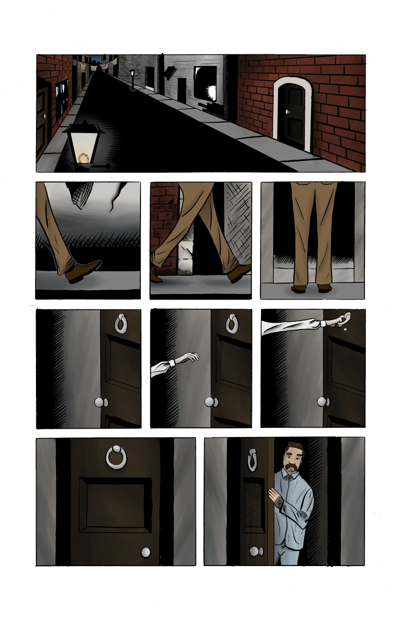
Now it’s time to build on those flat colors. I assigned the base colors to layer masks, and started shading. Manga Studio 5 has some great tools for shading, such as brushes that blend as they paint. You can also paint with transparency, which means you can use a blending brush as a kind of eraser that blends while you erase. It doesn’t seem like it would be that valuable, but it allows for quick and easy blending that produces a certain hand-painted look that I, personally, really like. I tried to use complementary colors for the shading. For example, on the doors, I used a very dark blue to shade it, rather than a dark brown or black. I really like the results, and I think it breathes life to the colors.
It’s amazing how much form shadows give to your colors. The flats have an interesting look on their own, but when you look at the shading by itself you can really see the form of the shapes come off the page.
Another thing to note is that the shading on its own doesn’t really appear to have that much hue to it. It looks mostly grey. However, when you add the base colors beneath it, the color really seems to come out.
Step 6: Lettering and Final Thoughts
Now it’s time to finish up the page. A comic isn’t really a comic without the words, right? So, I added all those beautiful words penned by the great Jordan Kirian. We got together and decided on what we believed to be the optimal placement for the words, and with our powers combined we were able to make a comic page that I’m not ashamed to put my name on.
One of the hardest things to do as an artist is to not hate everything you’ve created. Once you’re done it’s important to show your art to others so you can get some honest criticism. This is how I see if everyone else hates it as much as I do. So, if you’re reading this, please leave your thoughts below. I would greatly appreciate it.
So, this was The Creation of a Page with Daschel Fortner. I had a blast making this page and I hope you’ve enjoyed reading about it. Thanks, and have an Eggcellent day!
