
Well, we’ve finally made it to the end of the creative process. I would say the end period, but there’s an epilogue to all this (next blog post!) And what is the last leg of creating a comic? It’s lettering! It seems to me that a lot of people might ask what a letterer does. Some people think that the writer is the person who puts the words in the balloons. They think that’s what writing a comic means. But no. Any letters on the page, be they words or sound effects, are put there by the letterer. The letterer gets the script and decides the best types of fonts for dialogue and how to make a sound effect really fit the situation.
Much like the last couple of jobs in making comics, a letterer should be subtle, and is underappreciated. I’ll warn you right now, there’s not much glory in lettering. But that’s not what it’s about, so don’t sweat that. My first point, subtly, actually is important though. Like color, when you letter a comic, you don’t want to overpower the page. You want your word balloons to draw the eye, but not punch that eye in the face. This is more common with sound effects. When you make a sound effect, you have to walk this fine line of making, let’s say, an explosion, but not letting it override the art. It can be a bit hard at first, but with a little practice, and reading comics, you’ll see what I mean. Take this for example:
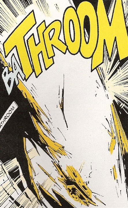
See that sound effect? It’s an explosion that reads like ba-throom, and it’s actually a bathroom blowing up! It’s huge, but look at that subtly.
As I said, the letterer is not as celebrated as the writer and artist, but without a good letterer, the story can derail pretty quickly. Imagine you are reading Conan the Barbarian. He’s a big, angry guy who cuts a lot of people into little parts, right? Well, what if he had a font that was in cursive? Or dotted every “I” with a heart? That would pull you out of the story. Here’s this big barbarian, and in cursive he sounds far too elegant, and with that heart over the “I”, it’s like he’s writing a note in middle school! See what I mean? It doesn’t quite read right.
So, what is the process of lettering? First of all, you have to read that script! Luckily, I letter my own script, so this is easy. You have to note tone, or if the writer has mentioned a certain type of font or color for words. If you letter your own stuff, you already know what you want, which is really nice. Then you take a look at the art and decide where everything should go. Before you lay down those letters and bubbles, you have to run through it in your head. Look at the space on the page and decide where everything would fit best. This is why it’s good practice to lettering if you are a writer. When writing before lettering, I didn’t consider anything but the story. Now I gauge how much space I’ll have per panel. It’s like writing and art. If you do it yourself, you know what your asking someone else to do. Your letterer is going to have a much easier time if you can visualize space ahead of time.
Once you’ve got it all laid out in your head, then you can actually start! To letter, I use Adobe Illustrator. As a quick side note, I always find it ironic that I never actually draw in Illustrator, I always use it for letters. Now, that being said, you can letter by hand, but I have no idea how to do that in any good capacity. It requires tools and techniques that I’ve never used. When lettering by hand, I pretty much just use my hand writing (albeit neater). If you want to letter by hand, I would read stuff by people like Todd Klein, who’s probably lettered the most. Ever. Anyway, you want to set up different layers, bubbles underneath text, that way your words will appear in front of your bubbles. Some people lay down words first, then add bubbles, however, I do the opposite. I don’t know if that is the wrong way to do this, but it’s just the process I got into.
You might not put any thought into this while reading comics, but someone has to design those bubbles. They are usually standard speech bubbles. But what about the jagged edged bubble of words coming over the radio, or the thought balloon? Sometimes people get pretty creative with balloons, take a look at this example:

That bubble really helps give the reader a feel for the character, doesn’t it? (That’s by Todd Klein, by the way). Many of the bubbles I’ve made are the standard kind, so I haven’t done much exploring. But some letterers can really do a lot! It’s here that you really have to pay attention to the space in a panel, you don’t want your bubbles to make everything look too crowded. So put them in spots where they don’t get in the way!
Once you’ve decided what each bubble needs to look like, and where they go, you can add the text. This is the real fun part, because you can play around with fonts. I love playing around with new fonts. That’s probably not something people say a lot, but lettering has given me that appreciation. This is the stage where it’s really nice to letter your own work. First off all, you know the emphasis and how each character sounds. Plus, you can make any last minute changes to a script so much more easily. I can’t remember who said it, but I once heard that lettering is to the script what inking is to pencils, and I couldn’t agree more. Those words, and how they look, will give what you’ve written complete life.
Now, as I just said, you get to play with font. Not everyone is going to have a special font, but if you want to give someone say, a robotic tone, or a fancy tone, you can find fonts for that. So, while your reader isn’t actually hearing the character, their brain will process it like they are. There are a lot of good font sites out there, but websites like Blambot and Comicraft are specifically for comic books. Take your time here, play around with fonts, and see what works best. You’ll also have to fit the words into the balloon nicely. That means, not too much white space, but not too little. You want it to look very even. Unless your character has a small voice, then if you add more white space, it looks like they are meek.
Once you’ve chosen the right text, and it looks nice (that takes time, some of my bubbles even now are pretty rough looking), you get to add the tails. Those are what tie the word balloon to the speaker. You can make it a straight tail or a curved tail, using different pen tools. You should always make it clear to whom the tail is pointing, and, even though this sounds like common sense, make it point toward the mouth. The common rule of thumb is to extend the about halfway to the character’s mouth, from the word balloon. Then, you can join the bubble and tail together, and you have your lettering! Once you do that for every panel, you’re done! You’ve made a comic.
That’s right, you have made a comic from top to bottom, and that’s that! Except, my next blog with be an exciting epilogue to this whole process: publishing! So join me then.
Recommended Reading
Comic Book Lettering: the Comicraft Way by John Roshell and Richard Starkings (READ THIS!)
DC Comics Guide to Coloring and Lettering Comics by Mark Chiarello and Todd Klein
The Complete Guide to Self-Publishing Comics by Comfort Love and Adam Withers

Worth reading. Take the time. Jeff
LikeLike